St Jerome's Laneway Festival
Digital Strategy
Experience Strategy
UI/UX Design
Accessibility Design
Design System
Interactive Style Guide
Webflow Development
Custom Development
Audience Republic Integration
Technical Consulting
Over three consecutive festival seasons, Extra Medium partnered with Bolster Group to redesign and rebuild the St Jerome’s Laneway Festival website. Each year introduced new creative direction, operational requirements and technical challenges, requiring a platform that could evolve rapidly while remaining stable, accessible and scalable.
Laneway Festival operates across six cities, each with unique lineups, schedules, ticketing rules and partners, all under intense time pressure and public scrutiny.
Prior to our involvement, the website was fragmented across multiple microsites, difficult to update and disconnected from the festival’s visual identity. Each season introduced new artwork, new requirements and new constraints, without room for platform instability.
The core challenge was to create a single digital platform that could support annual creative reinvention while remaining operationally efficient, accessible and easy to manage internally.
A Three-Year Platform Evolution
Rather than treating each season as a standalone project, we approached Laneway as a continuously evolving digital platform. Each year built on the last, allowing the website to adapt to new creative directions and operational needs without compromising stability, usability or accessibility.
Year 1: Foundation (2023)
We focused on fixing structural issues and establishing a reliable baseline.
• Reworked information architecture to reduce friction
• Consolidated city-specific microsites into a single platformMigrated the site to Webflow for internal content control
• Established accessibility and UX foundations
This phase delivered a stable, manageable platform that removed duplication and simplified updates.
Year 2: Systemisation (2024)
With the platform stabilised, the focus shifted to scale and consistency.
• Introduced a robust future-proof design system
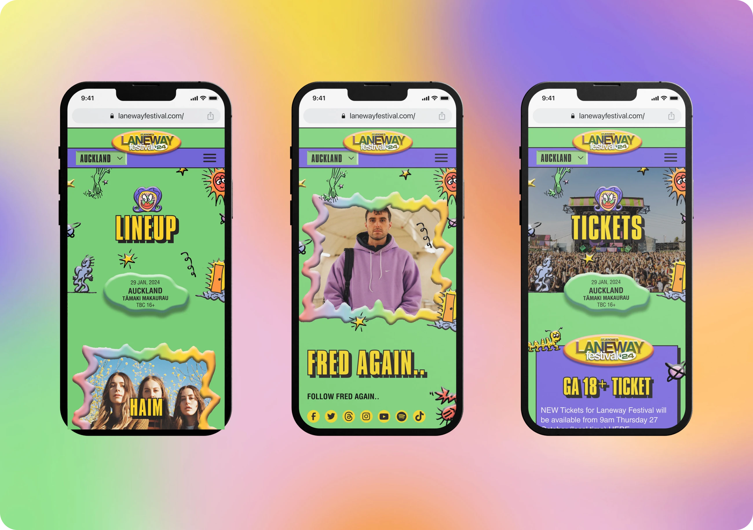
• Implemented city-based colour logic for clarity and differentiation
• Refined navigation, performance and content workflows
This allowed faster seasonal rollouts while strengthening visual and functional cohesion.
Year 3: Refinement (2025)
The most recent phase focused on expression and polish rather than reinvention.
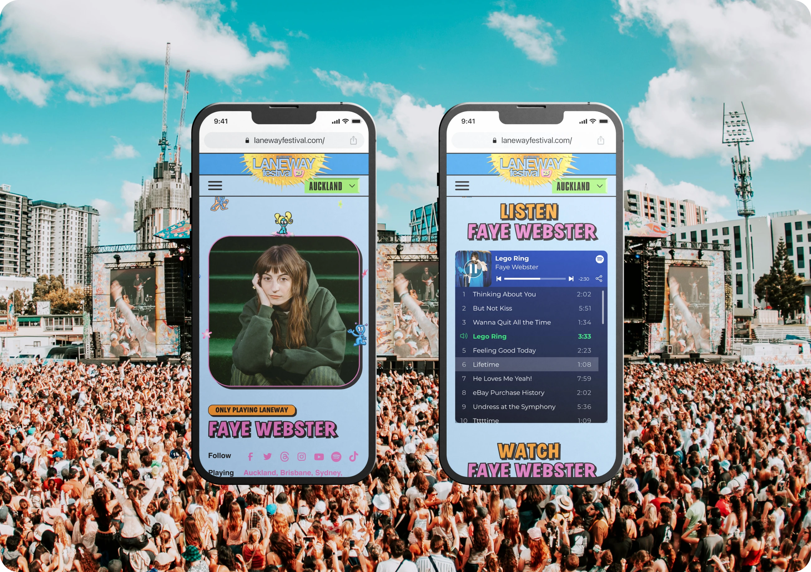
• Elevated interaction and motion design
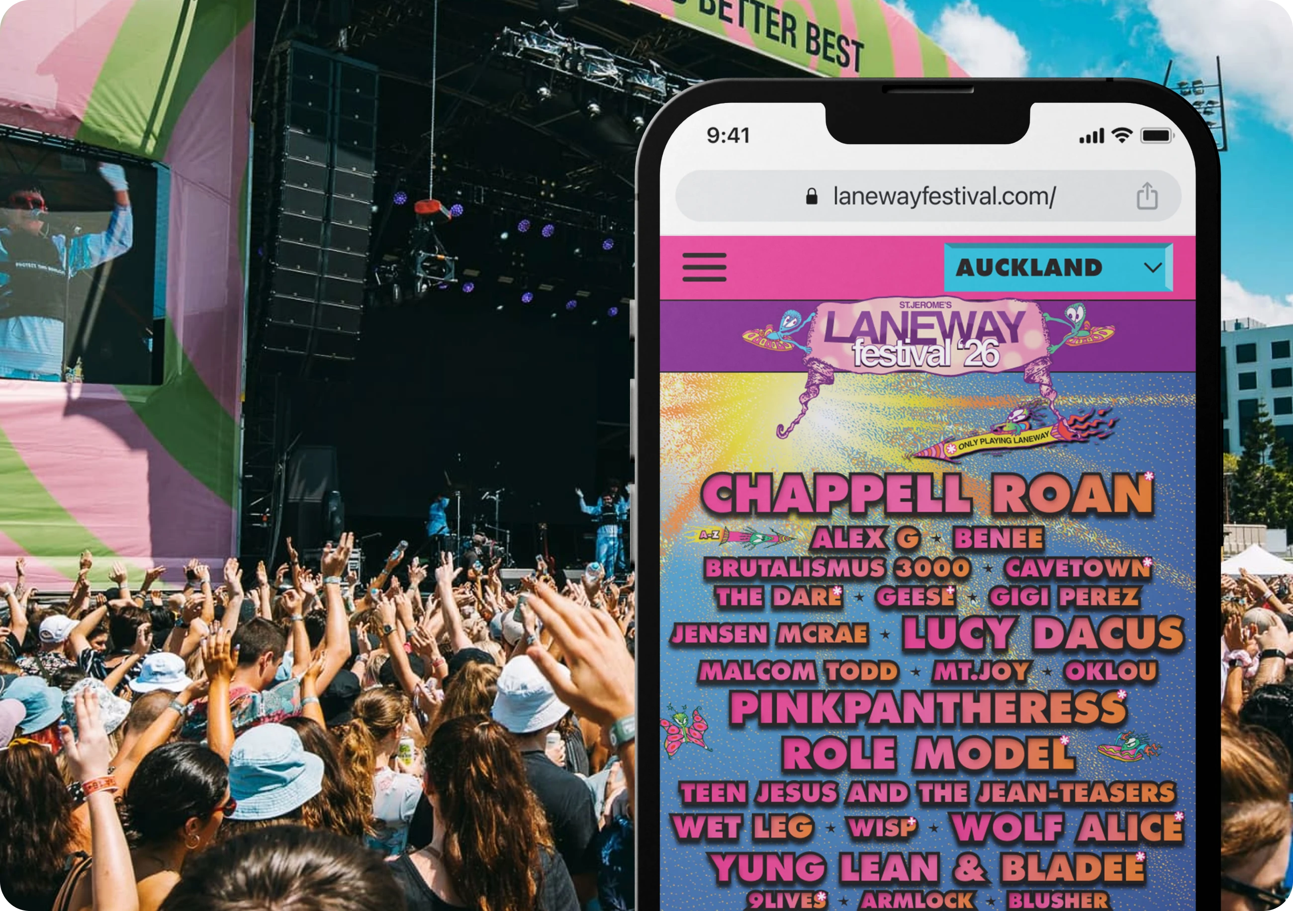
• Integrated artwork in more unique creative ways to make each year feel fresh and new
• Continued refinement of accessibility and core UX patterns
The result was a confident, recognisable platform that could evolve year to year without disruption.
01 Digital Strategy & Technical Consulting
02 UX Discovery & Strategy
03 UI/UX Design
04 Design System
05 Interactive Style Guide
06 Webflow Development
07 Custom Code & Integrations
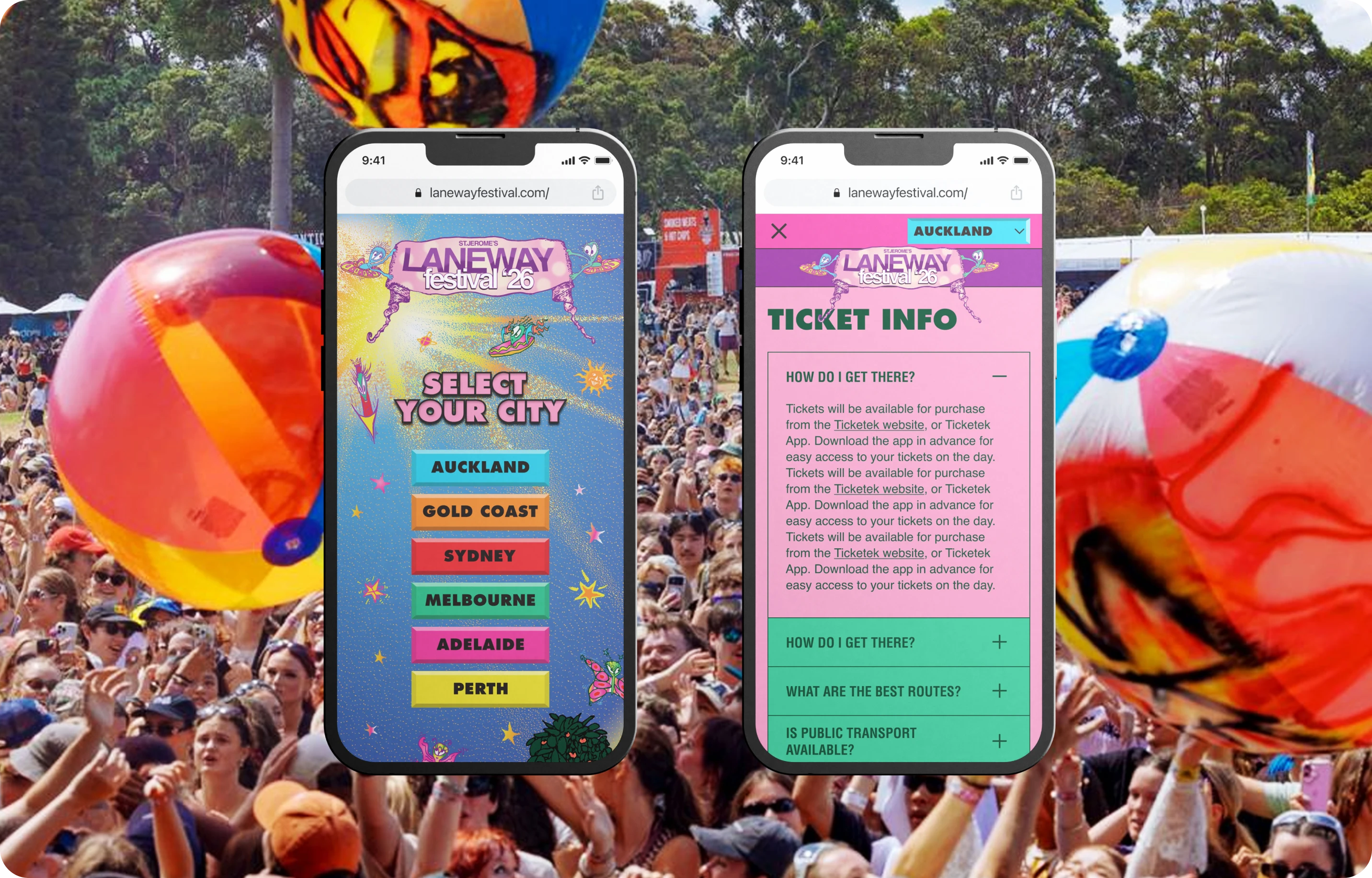
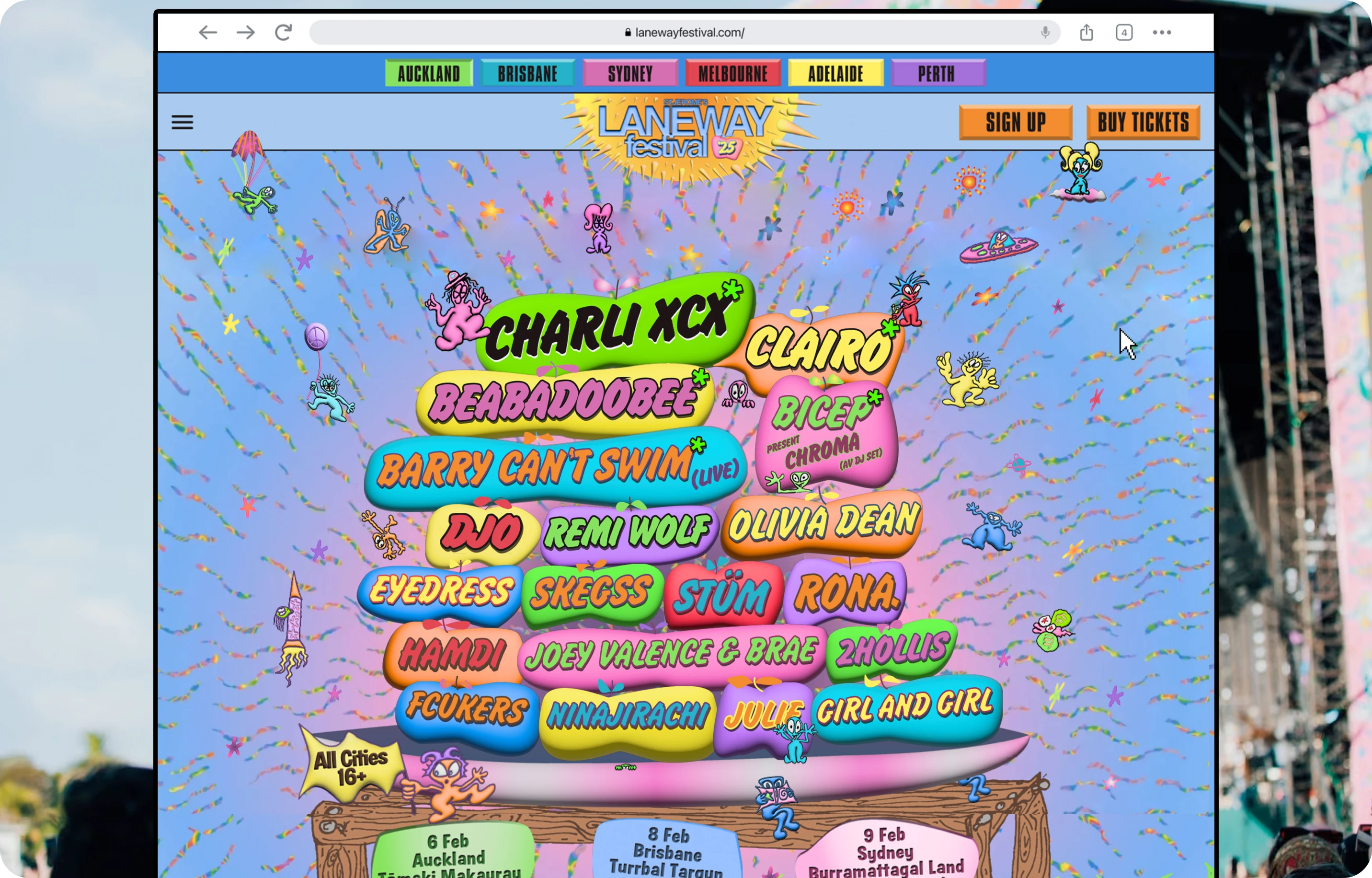
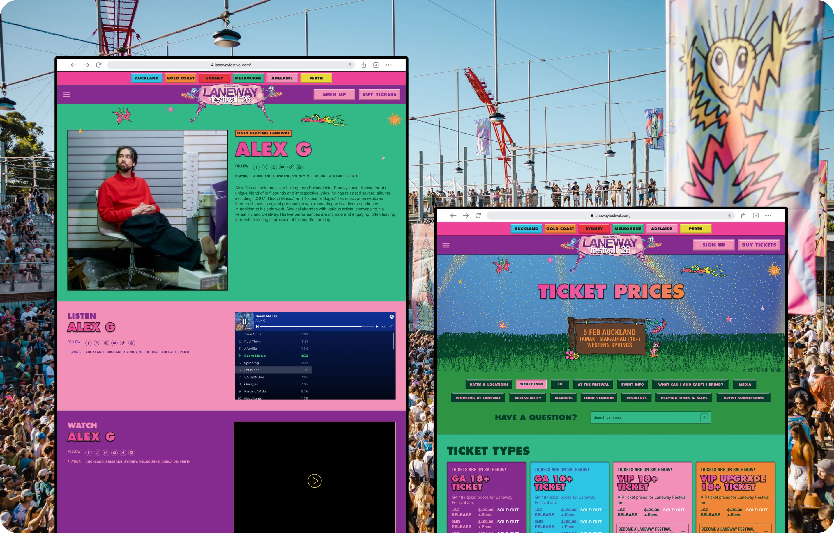
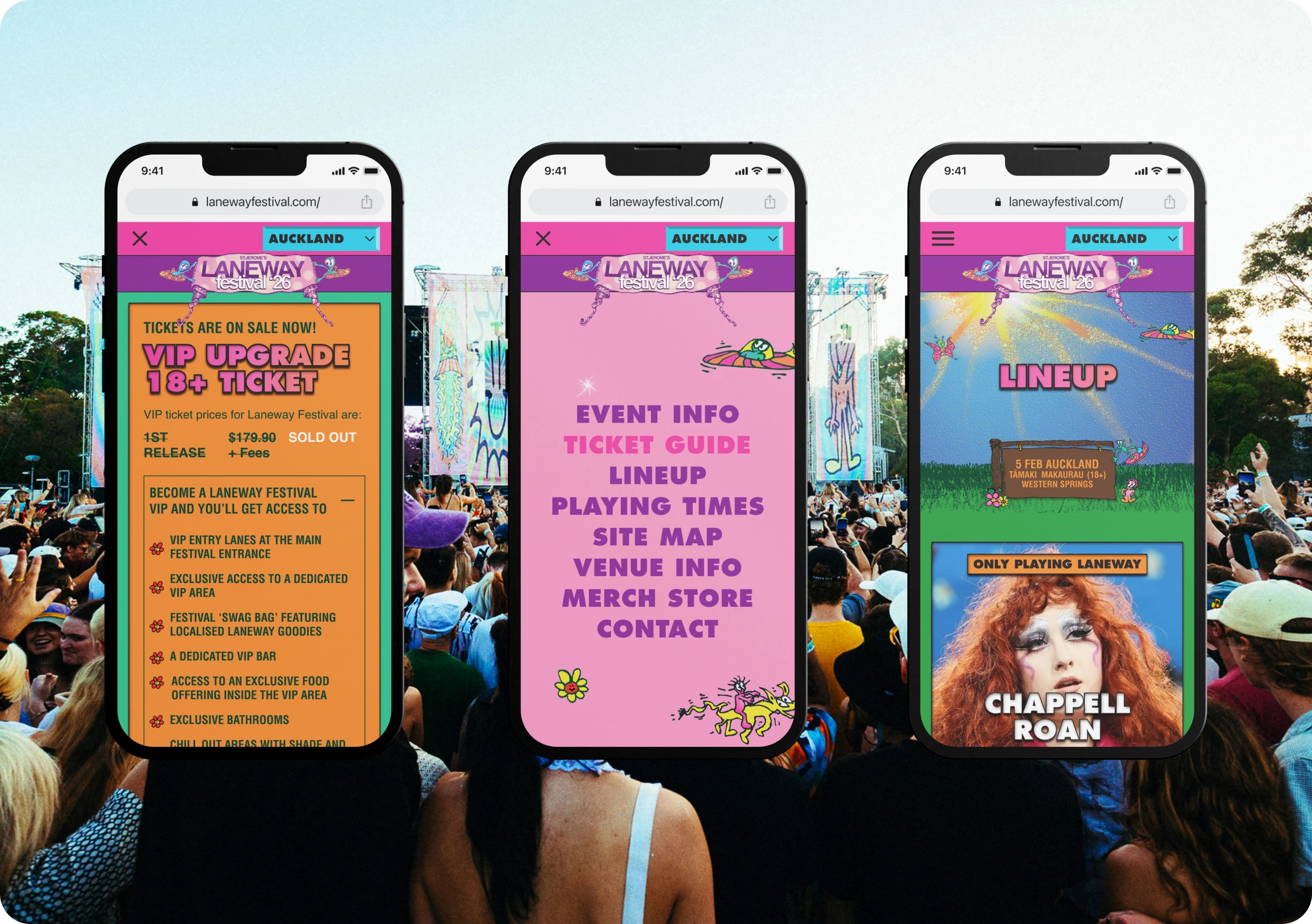
We established a design system designed to evolve year after year. Accessibility was prioritised through the use of a robust sans serif typeface for body copy, paired with a flexible colour system that allowed the festival artwork to remain the hero.
Each city was assigned a primary colour palette tied back to the seasonal creative direction, making city-specific content easier to navigate while maintaining a cohesive overall identity.
Laneway’s audience spans a wide demographic, from first-time festivalgoers to long-term attendees. The experience needed to support fast, confident decision-making with no dead ends.
We replaced the existing information architecture with a city-first approach that made it easy to locate relevant information quickly. A sticky city selector and colour-based navigation system allowed users to move between locations with confidence and clarity.
The previous website required developers to make content updates, which was misaligned with the pace and unpredictability of live events.
Migrating the platform to Webflow allowed the Laneway team to manage content independently, respond quickly to changes and meet strict launch deadlines. The platform also supported multiple third-party integrations required for ticketing, scheduling and festival operations.
Laneway wanted the digital experience to reflect the energy and character of the festival itself.
We introduced subtle scrolling interactions, transitions and micro-interactions built using CSS and JavaScript, all developed internally by the Extra Medium team. These elements brought the artwork to life without compromising performance or usability.
Custom cursor behaviour and interactive buttons referenced 90s digital aesthetics while remaining intentional and restrained.
